Packaging
Packaging is crucial for product success. It protects, attracts, and informs. Good packaging can create strong brand image and influence buying decisions. Effective packaging is a key part of marketing and branding.
As a packaging designer, I have a wealth of experience in creating effective and impactful designs for a wide range of products. I understand the importance of packaging, not only in terms of protection but also in terms of attracting and informing consumers. I approach each project with a focus on creating a strong brand image and a visually appealing design that will stand out on the shelves. I take pride in delivering designs that not only meet but exceed my clients' expectations and drive sales for their products. With a passion for design and a commitment to excellence, I am dedicated to helping my clients succeed through effective packaging design.
︎ Label Design
︎ Whiskey
︎ Gold Foiling
︎ Premium Quality
︎ Design Paper
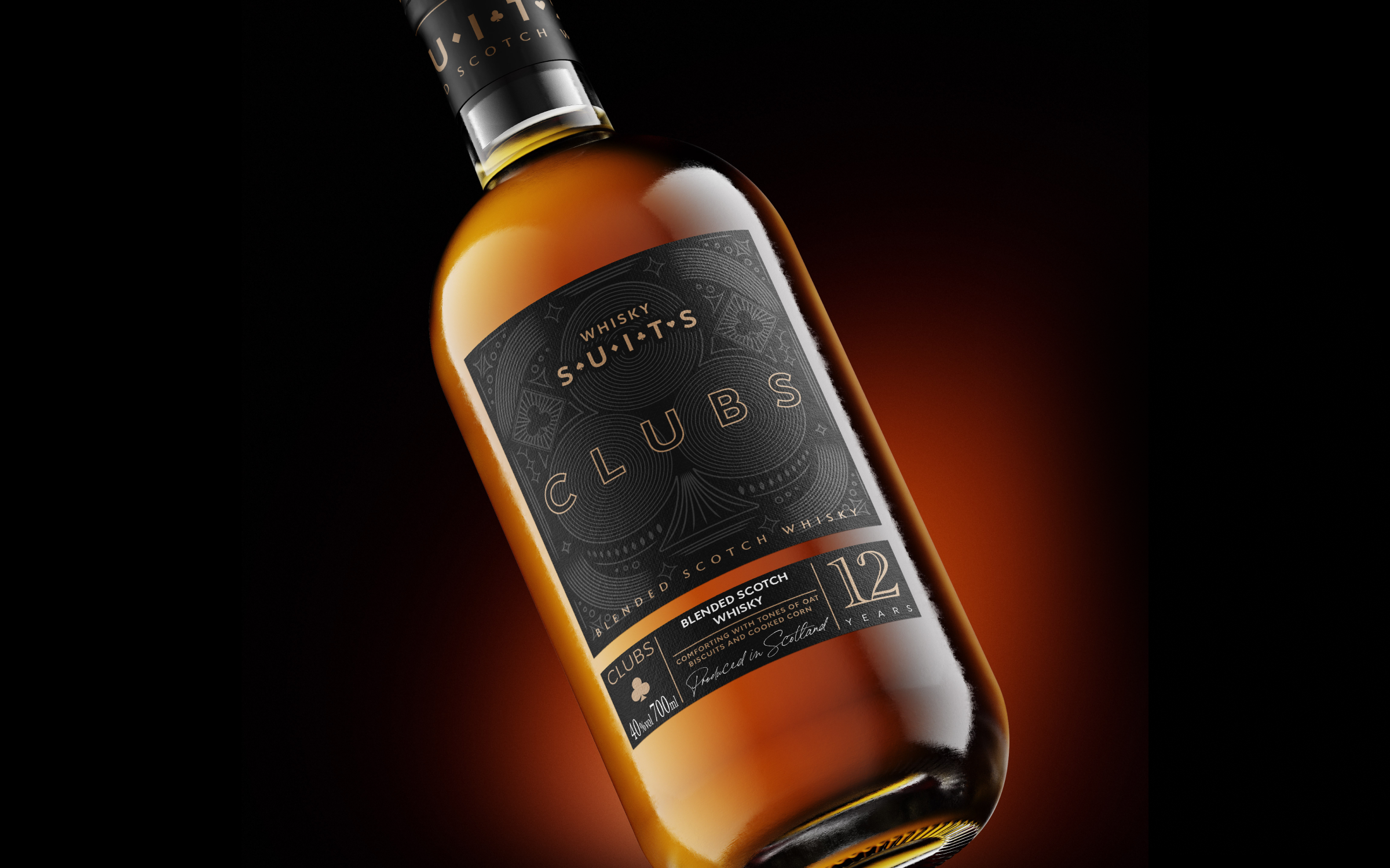
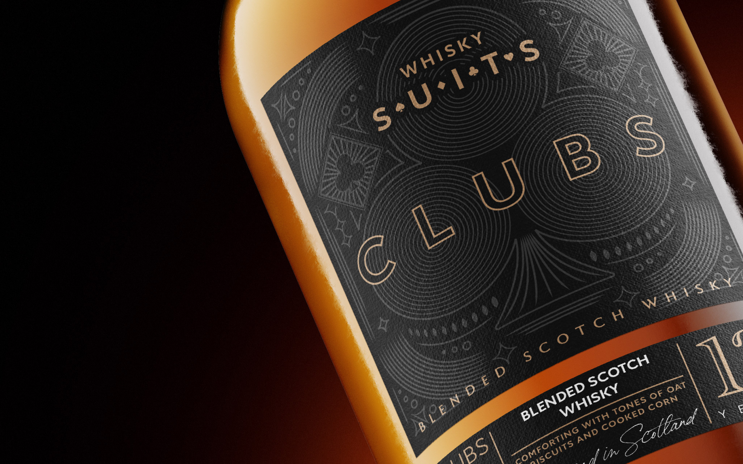
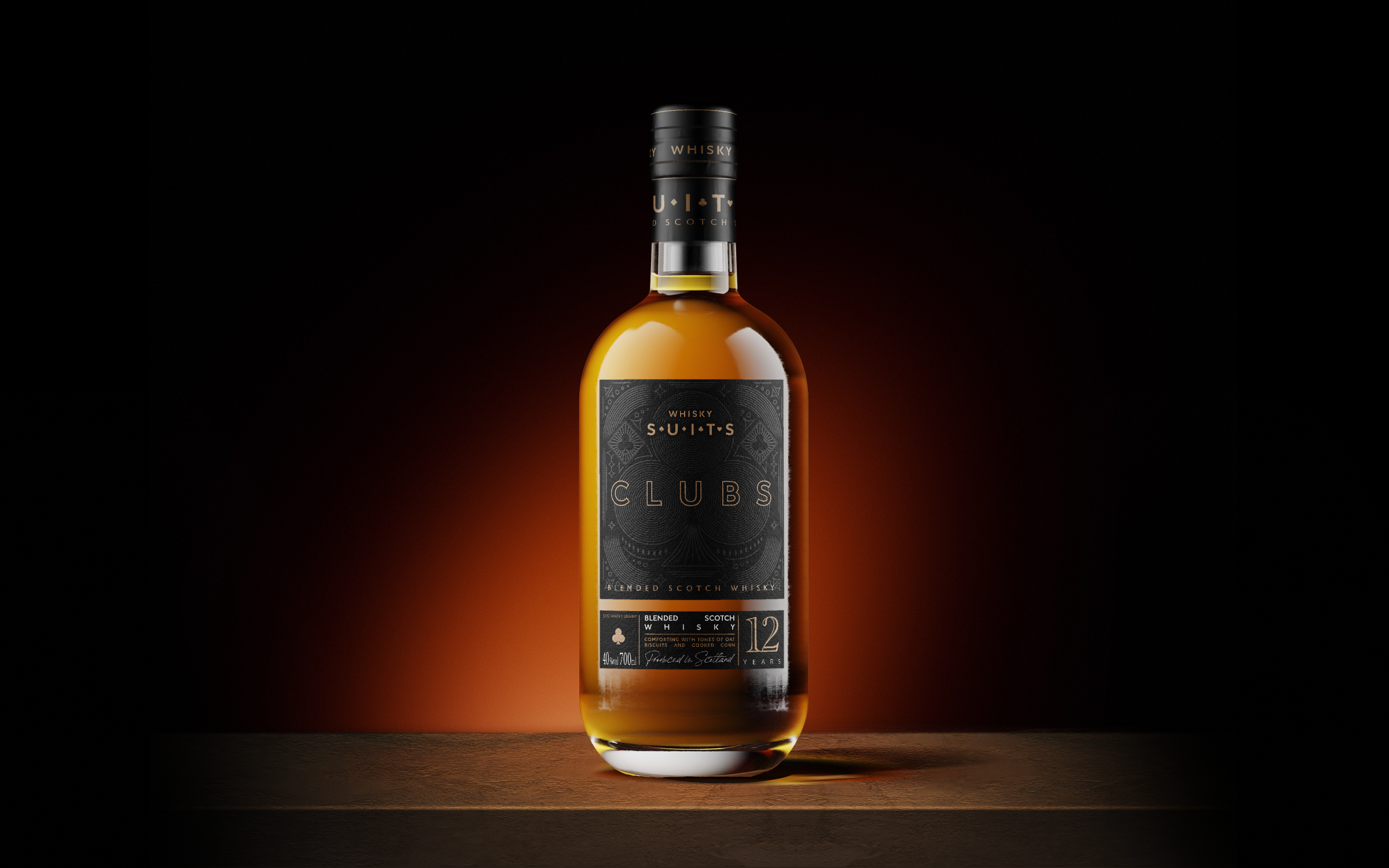
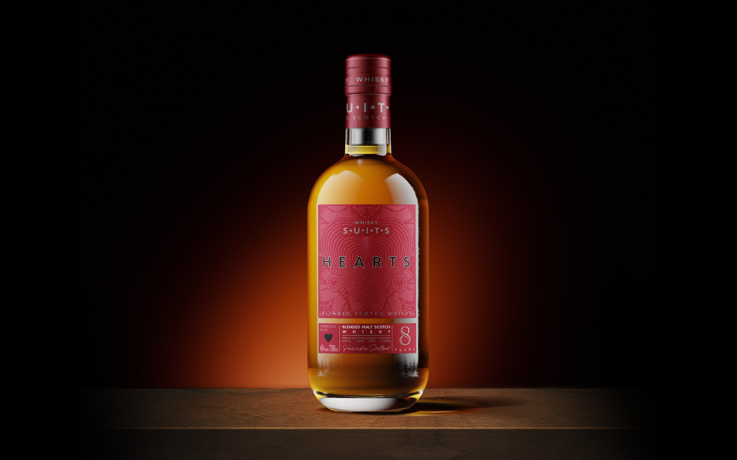
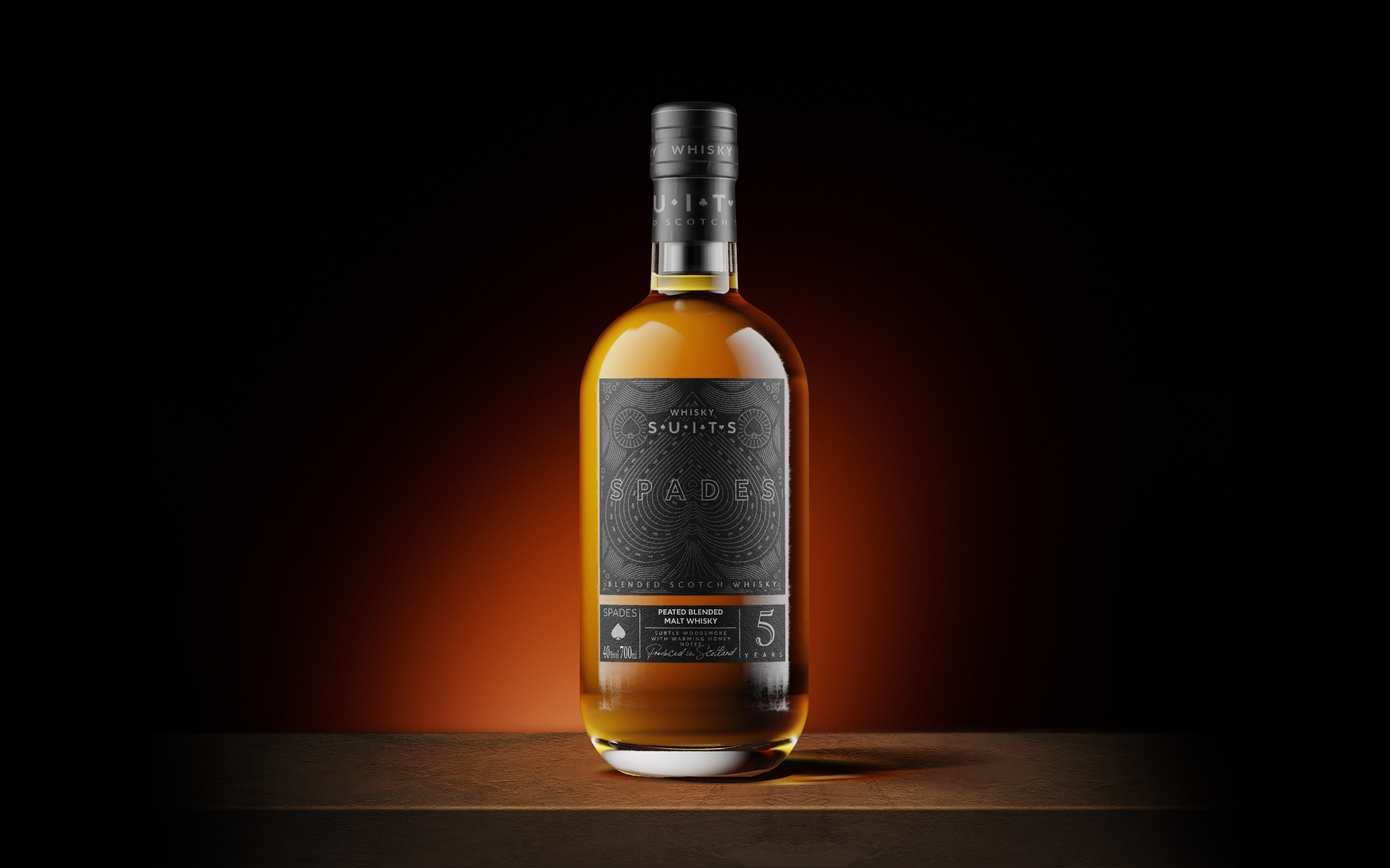
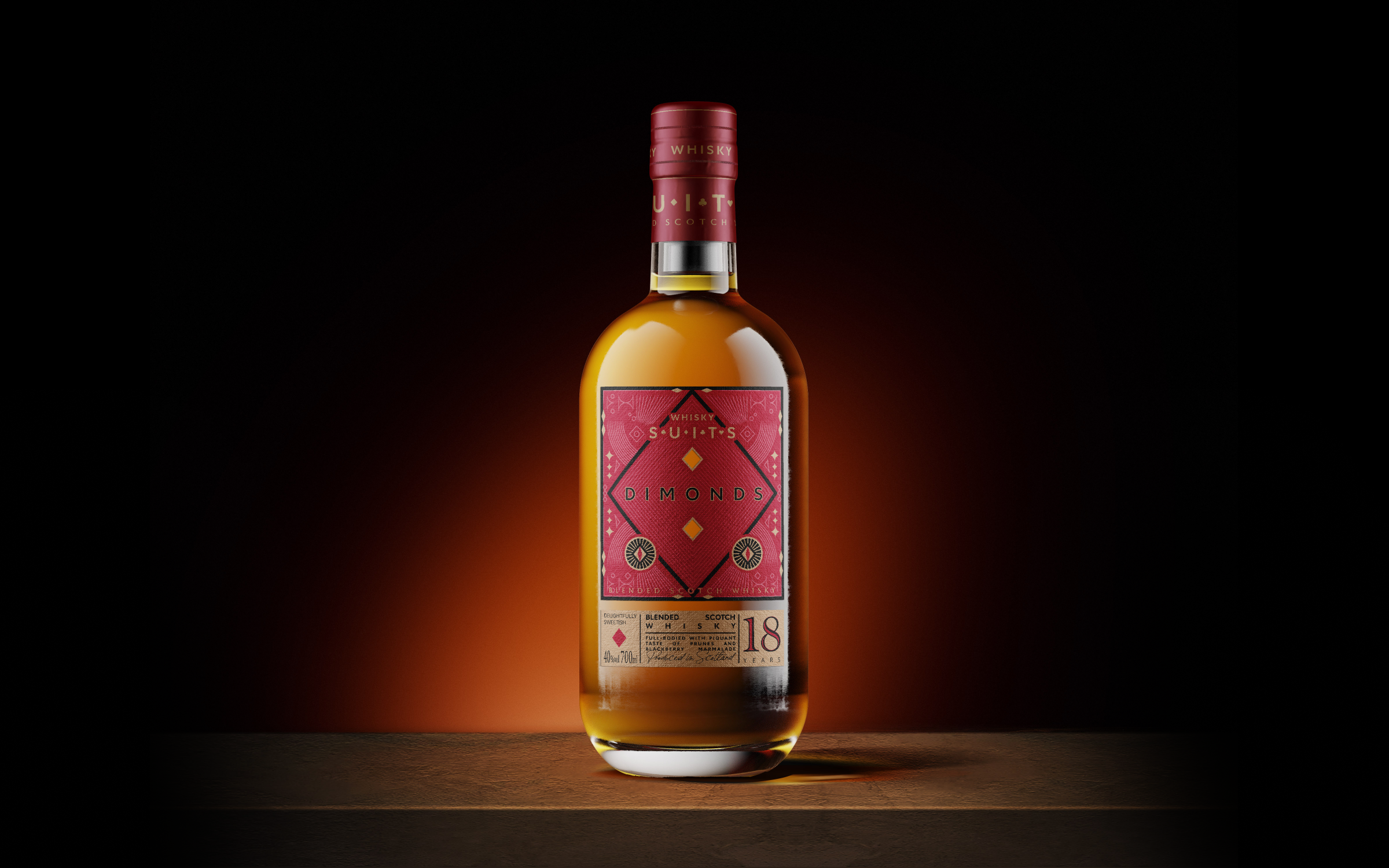
The whiskey label design project used gold foiling and card suits as the main design elements. The 4 SKUs each featured a different suit - spades, clubs, diamonds, and hearts - with gold foiling used to add luxury and sophistication. The simple, clean design allowed the card suits and foiling to stand out, emphasizing the premium quality of the whiskey. The result was an eye-catching and memorable label that effectively conveyed the product's high-end image.
︎ Design Paper
︎ Collaboration
︎ Colour
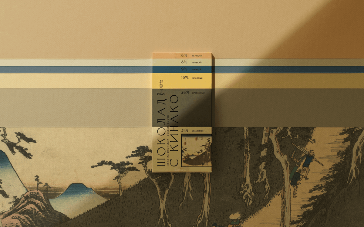
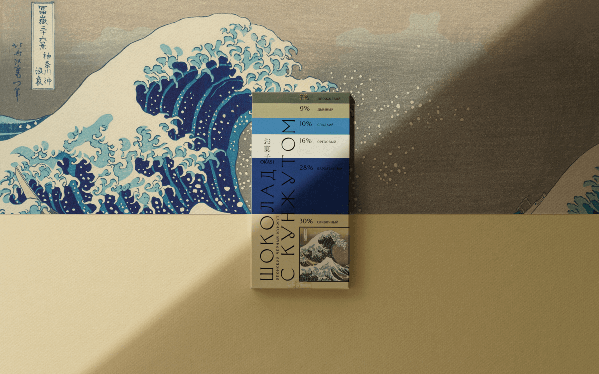
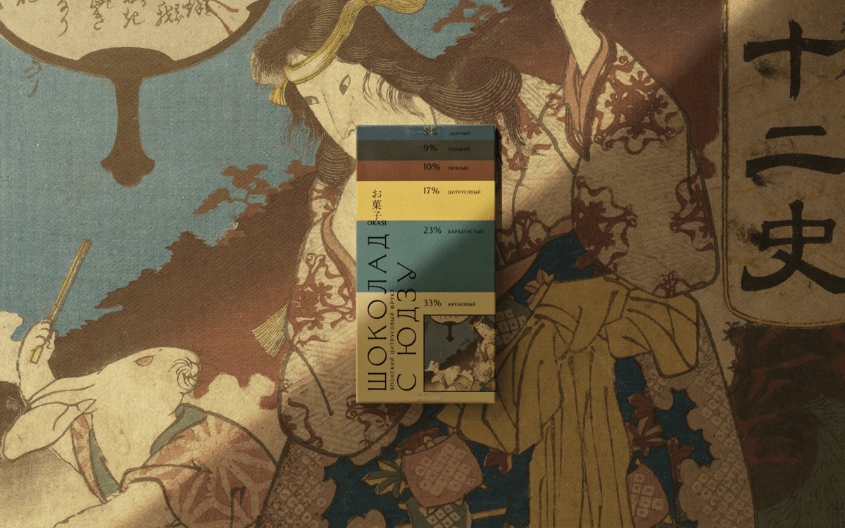
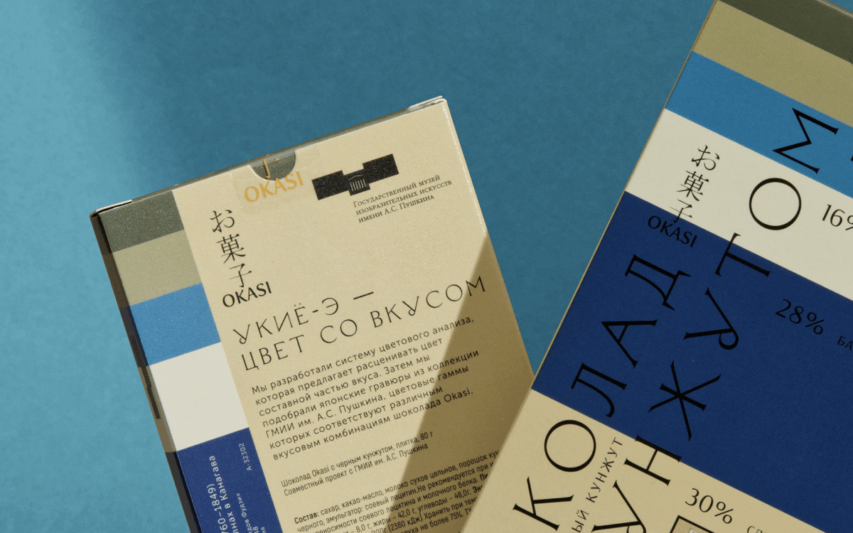
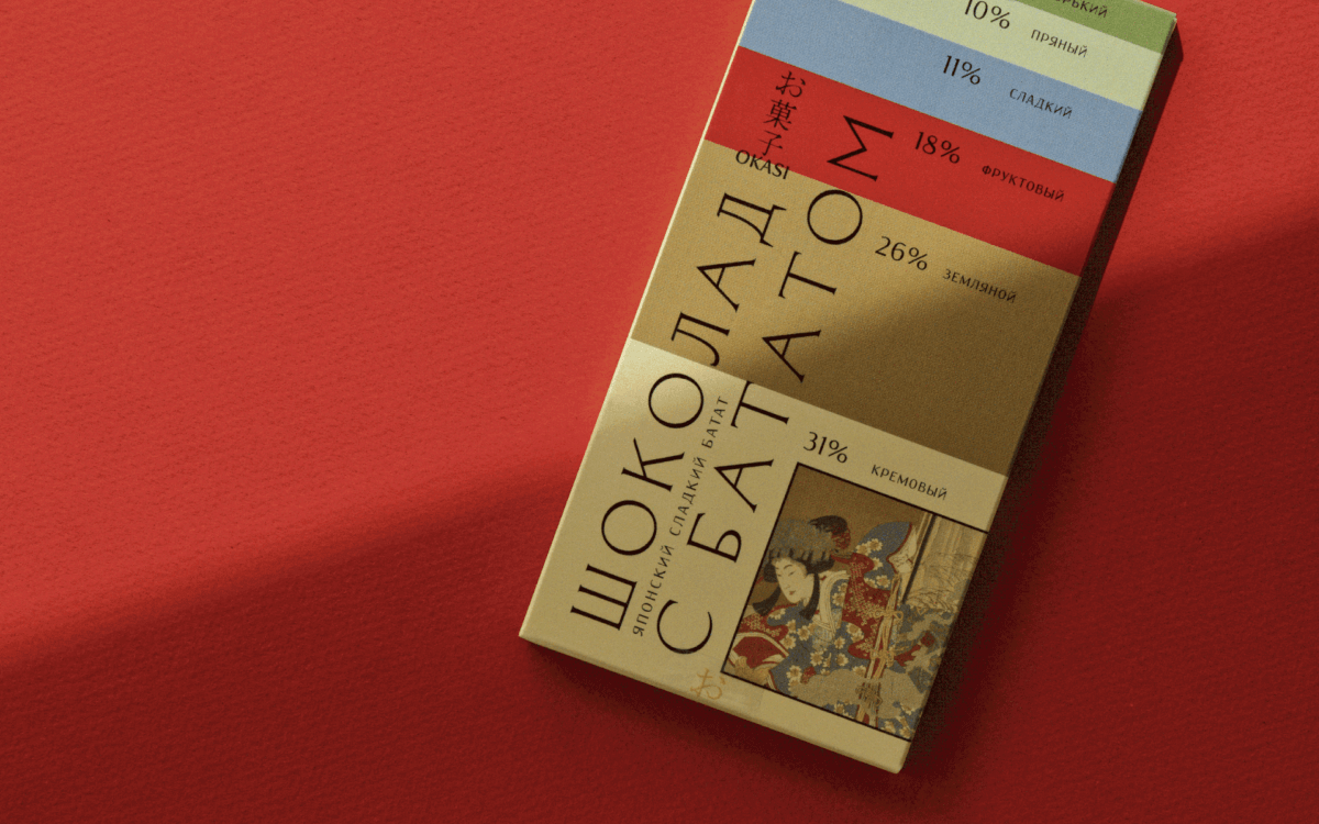
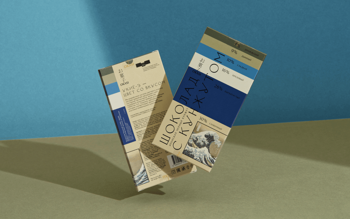
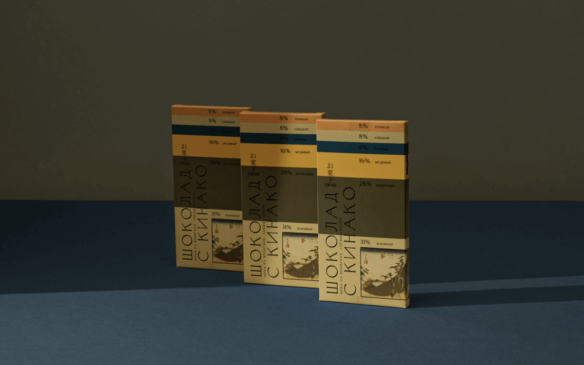
The packaging design for Okasi chocolate features a color analysis system and elements inspired by Japanese prints from the Pushkin Museum's collection. The design incorporates color as a component of taste, using a sophisticated color analysis system to determine the best color combinations for each flavor of chocolate. The colors used in the design correspond to the specific flavor combinations of the chocolate, creating a visually appealing and appetizing package. The Japanese prints from the Pushkin Museum's collection provide a beautiful and cultural backdrop for the chocolate, further emphasizing the unique and sophisticated nature of the product. The design is eye-catching and engaging, promising a satisfying and flavorful experience for those who enjoy Okasi chocolate.

︎ Zip Lock
︎ Face App
︎ Cookie
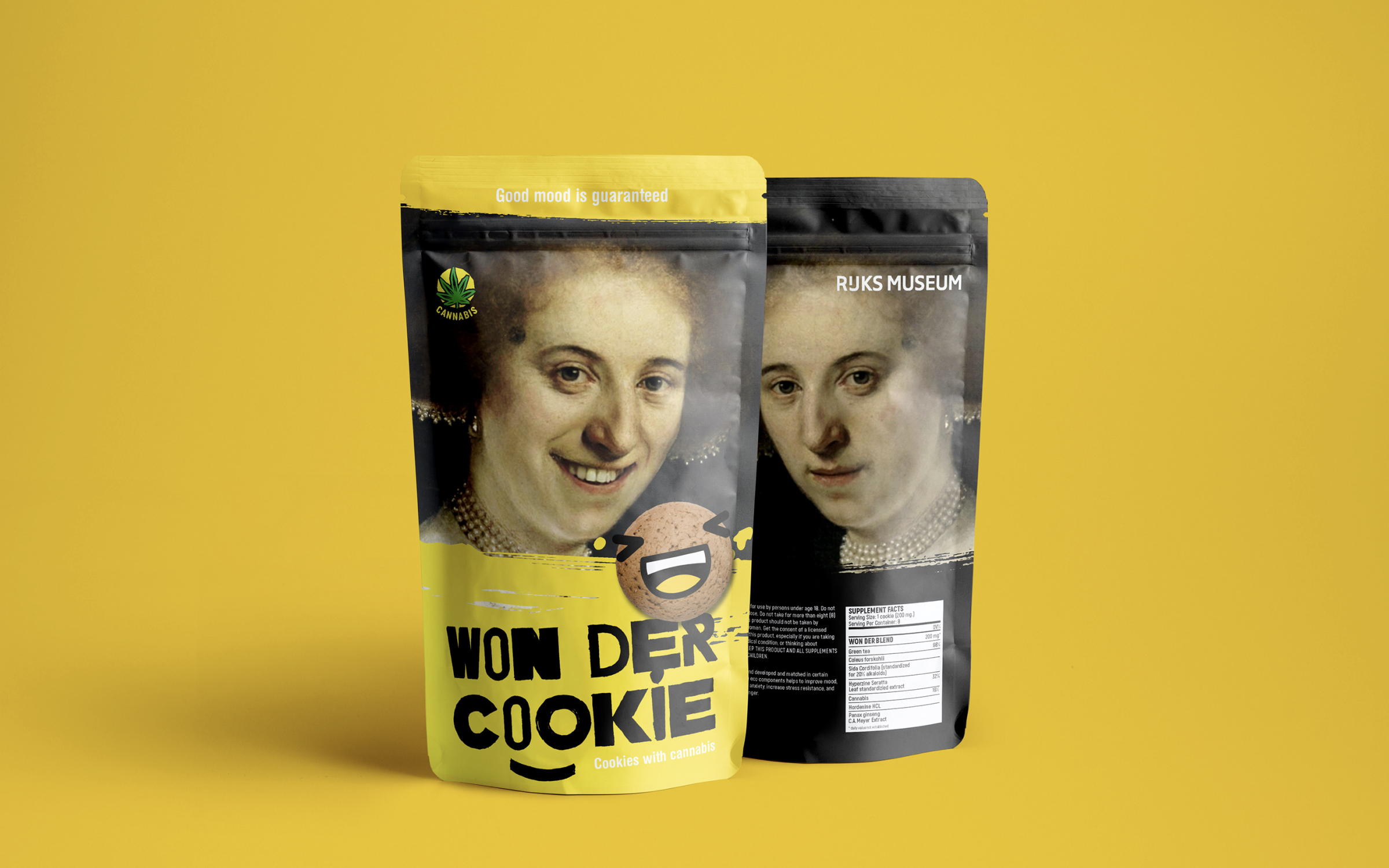
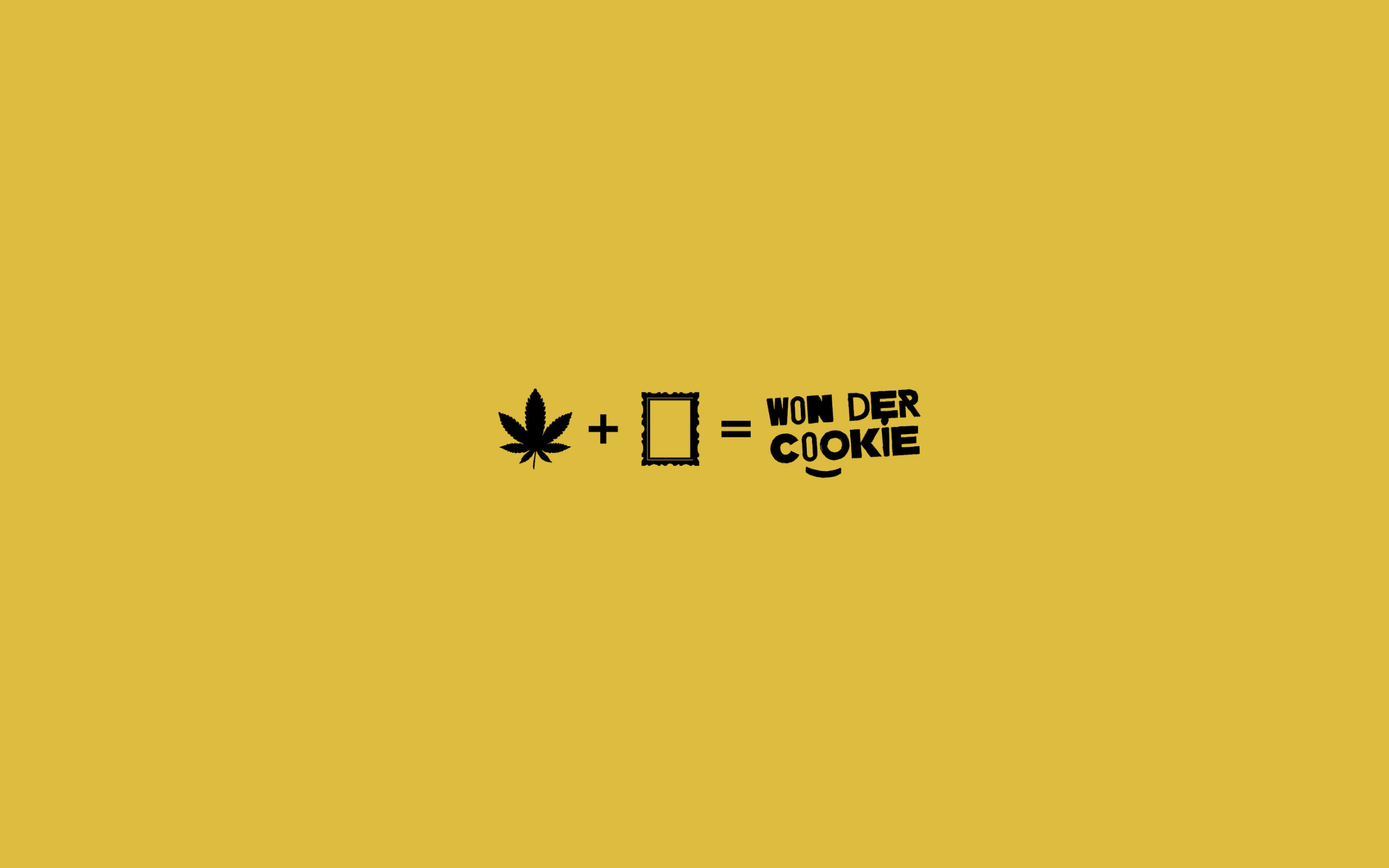
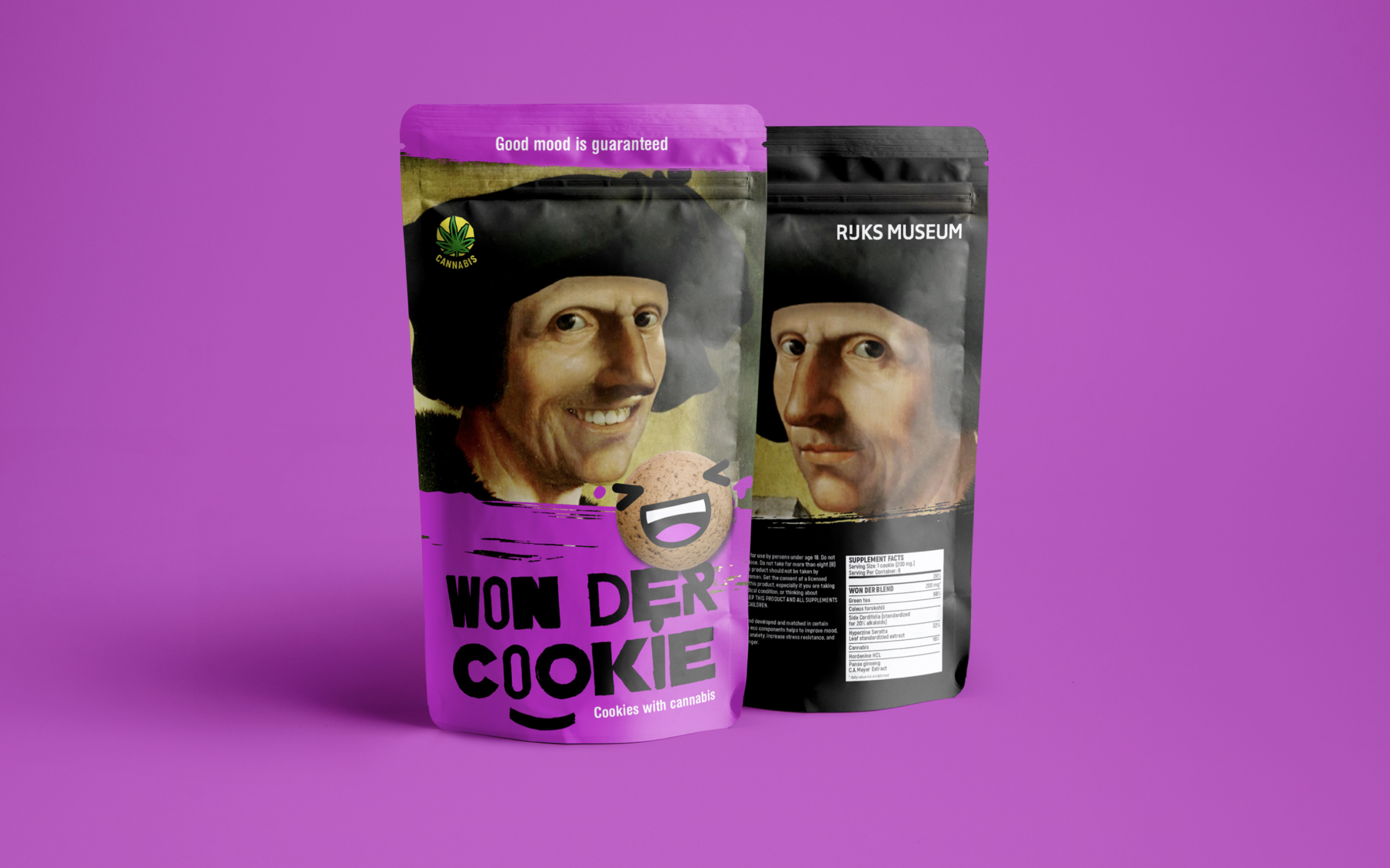
The packaging design for Rijksmuseum's cannabis cookies combines classic Dutch paintings with a playful face app. The design substitutes a smile for a photo and incorporates elements of Rijksmuseum's collection. The design is eye-catching with bright colors and playful imagery, creating a fun and inviting package. The design promises a good mood for those who enjoy the cookies, making them a must-try for anyone seeking a unique and lighthearted snack.


︎ Zip Lock
︎ Creative
︎ Coffee
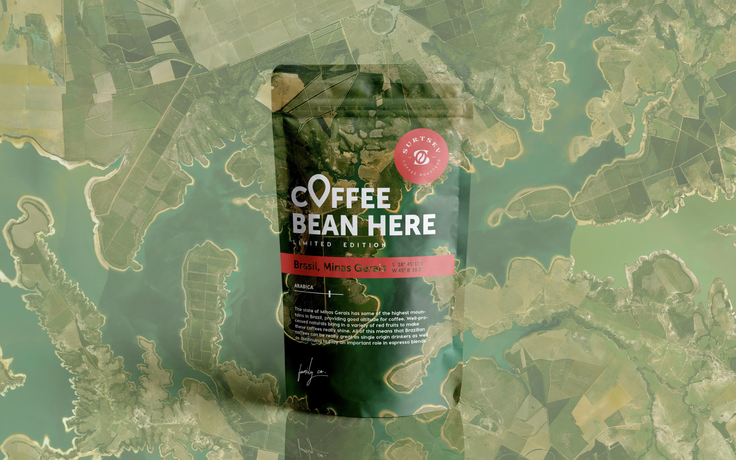
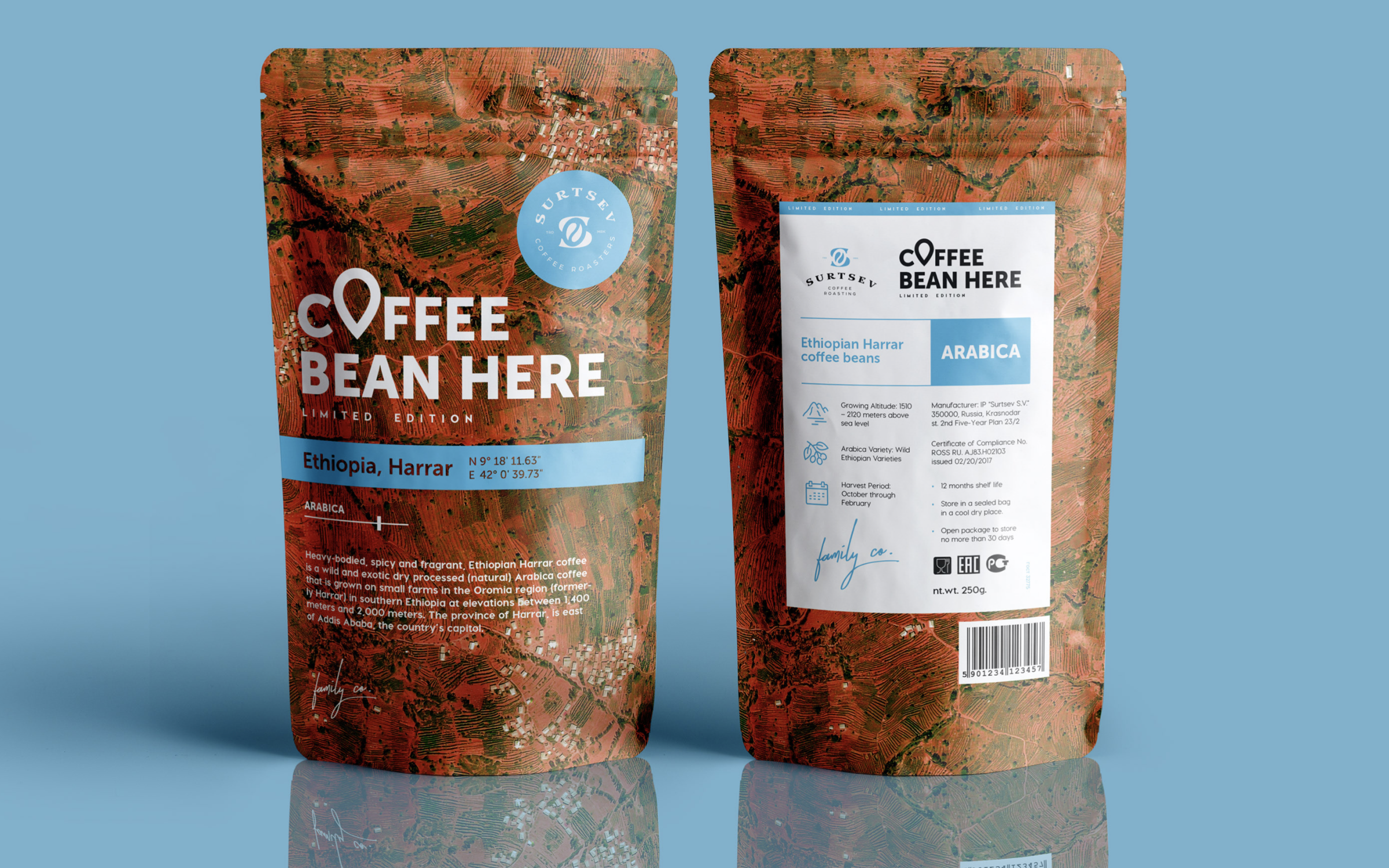
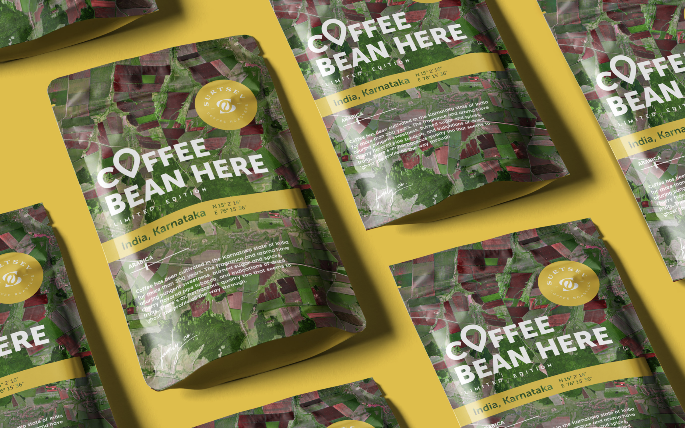
The coffee packaging design uses satellite images to showcase the place of production. The images highlight the unique landscapes and environments where the coffee is grown. The design emphasizes the connection between the coffee and its origin, allowing the consumer to see the region where the coffee was grown. The satellite images create an immersive experience, offering a visual representation of the location and environment behind the product.