
︎ Design Paper
︎ Collaboration
︎ Colour
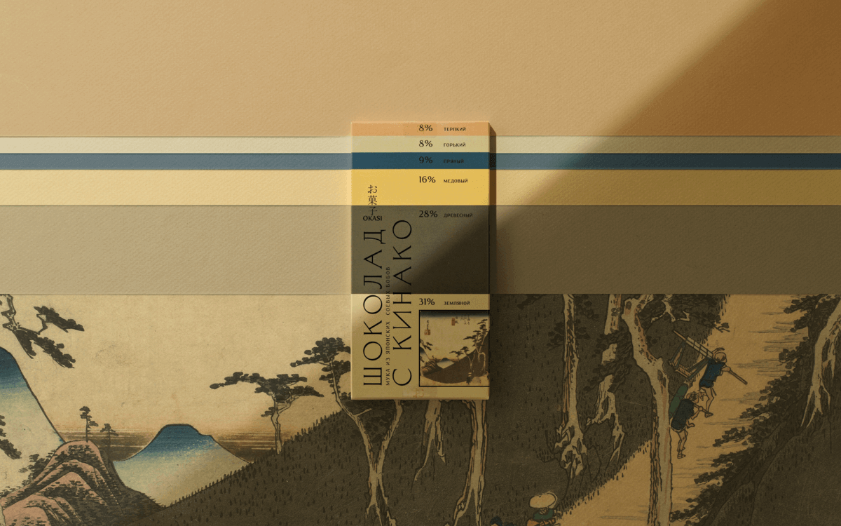
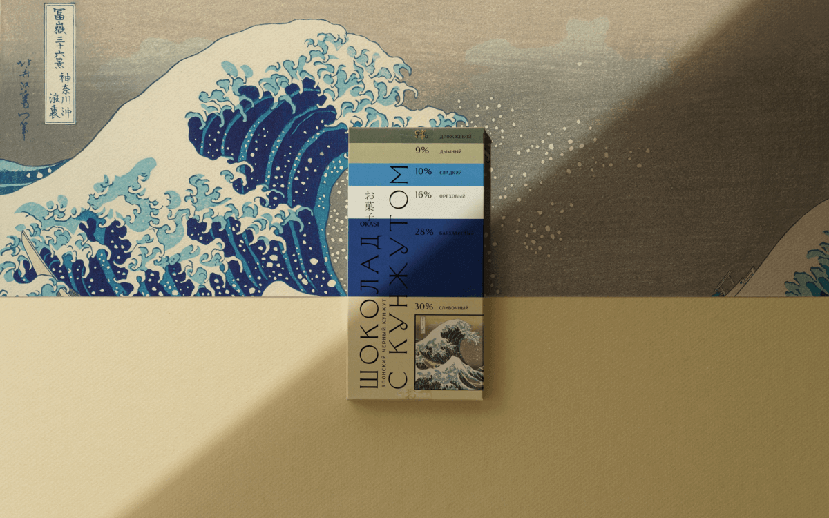
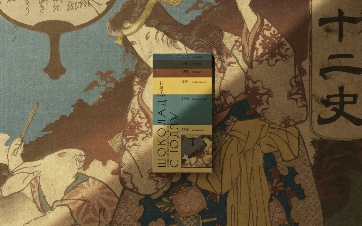
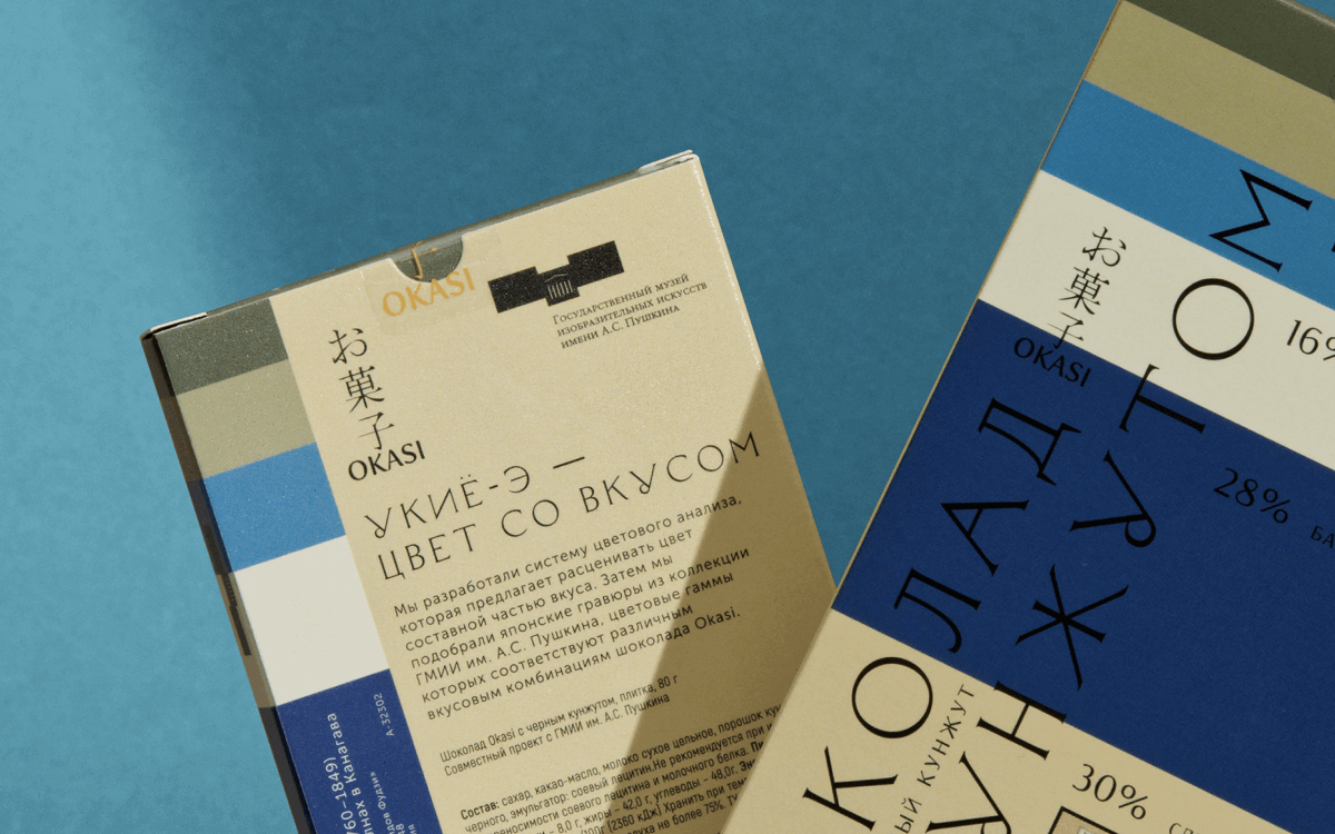
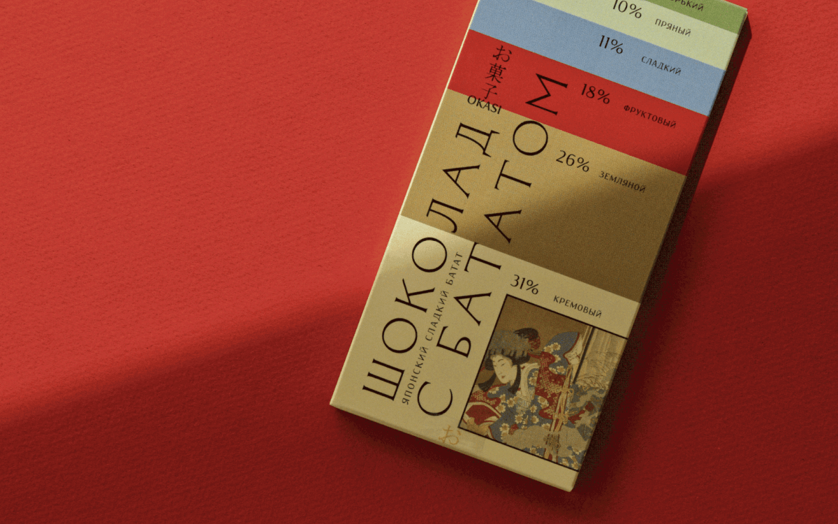
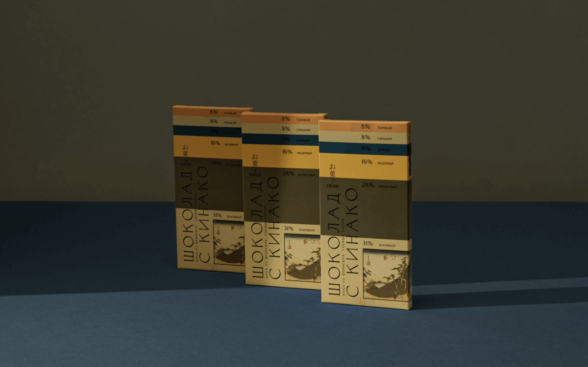
The packaging design for Okasi chocolate features a color analysis system and elements inspired by Japanese prints from the Pushkin Museum's collection. The design incorporates color as a component of taste, using a sophisticated color analysis system to determine the best color combinations for each flavor of chocolate. The colors used in the design correspond to the specific flavor combinations of the chocolate, creating a visually appealing and appetizing package. The Japanese prints from the Pushkin Museum's collection provide a beautiful and cultural backdrop for the chocolate, further emphasizing the unique and sophisticated nature of the product. The design is eye-catching and engaging, promising a satisfying and flavorful experience for those who enjoy Okasi chocolate.
︎ Collaboration
︎ Colour
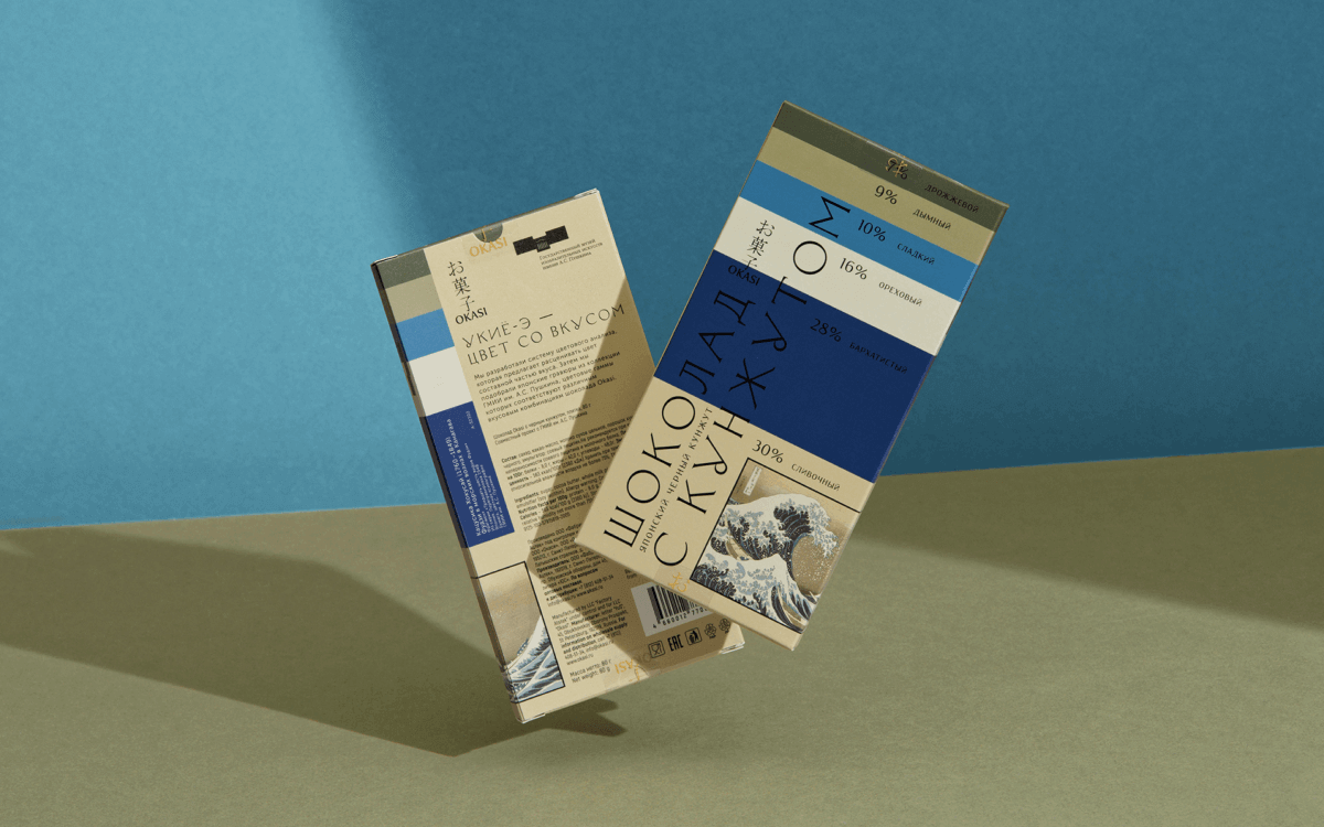
The packaging design for Okasi chocolate features a color analysis system and elements inspired by Japanese prints from the Pushkin Museum's collection. The design incorporates color as a component of taste, using a sophisticated color analysis system to determine the best color combinations for each flavor of chocolate. The colors used in the design correspond to the specific flavor combinations of the chocolate, creating a visually appealing and appetizing package. The Japanese prints from the Pushkin Museum's collection provide a beautiful and cultural backdrop for the chocolate, further emphasizing the unique and sophisticated nature of the product. The design is eye-catching and engaging, promising a satisfying and flavorful experience for those who enjoy Okasi chocolate.